Accessibility: complexity and contradictions in graphic design
Accessibility is a vital and increasingly recognised component of all design practice. But what does accessibility actually mean, what happens with accessibility requirements contradict one another, and how can graphic designers learn about accessibility implementation?
I’ve been lucky enough to work on several absolutely lovely projects over the last few months. But I figured that rather than painting a shiny, positive version of my life where everything is good and easy and I have all the answers — maybe I should instead share the story of when I realised I was wildly out of my depth, freaked out, worked a large number of unpaid hours trying to fix something, didn’t entirely manage to, and possibly lost one of my most loyal clients. I learnt a lot, and hopefully you might find it interesting to read about how and why.
But firstly, a few steps back.
Accessibility and design
As a graphic designer, my job is to communicate information to an audience. ‘Accessibility’ is an inherent part of that practice — graphic communication is all about making that given information accessible.
When I shared a first draft of this blog with my fellow bloggers, Kim noted that:
“Everything starts as being accessible to some people and you can make it accessible to more people by applying additional effort”.
Putting it as simply as possible, widening accessibility is about widening access to our designed materials to the greatest possible range of audiences.
Accessibility is all about equity — ensuring that as many people as possible can engage with the materials we create on equal terms. Basic levels of accessibility shouldn’t be an afterthought, it should be baked into everything we do, from the technical implementation of our various types of builds, right through to the choices we make about colours, typefaces, sizing and much more.
To what extent we then go above and beyond that (and what constitutes that ‘basic’ level) will inevitably vary from project to project, and designer to designer.
Accessible design makes our work better
For far too long, design as a discipline created solutions that work for a perceived average person, and disregarded those considered ‘outliers’. Aside from the fact that supposed outliers are a) way more common than people think, and b) regardless of their rarity, deserve to be catered for — many design solutions ostensibly developed with accessibility in mind actually make life easier for a much wider audience than just those with some formally recognised disability.
The invention of subtitles is a prime example — originally imagined as a tool only for those deaf or hard of hearing, subtitles are now used by a much wider audience — parents watching TV quietly so as not to disturb a baby, people watching videos on public transport, people watching TV in bars or restaurants with the sound muted, and many more settings.
To give another example from my own work life — it might be easy for a lecturer to think that there is no need for them to supply screen-readable text PDFs of readings for their students, as there is no one blind in their class. However, they are overlooking the multi-tasking part time student who listens to their reading on the cycle to work, the neurodiverse student who finds it easier to consume reading in audio form, or the student who has temporary eye strain from too much close screen work and needs a break, but doesn’t want to harm the environment by printing documents.
(For more reading on this topic, I recently finished reading Mismatch: How Inclusion Shapes Design by Kat Holmes, which I highly recommend as a general primer. I was actually reading it as a potential undergrad level text for my UX students, and felt very struck by its timeliness in relation to my own work.)
The topic of accessibility is something that I learn more about with every year that passes for me as a practitioner, and I have shifted from a grumpy undergrad designer myself who didn’t really want to take it into consideration (”But those colours look GREAT together, how many people are ACTUALLY colour blind REALLY?”) through to a professional practitioner and contractor who is both obligated to, and wants to ‘get it right’.
However, while some basic accessibility practices and choices should be a requirement of everything we do, others require additional effort. And others can even come into conflict with one another, leaving difficult decisions about which audience should be prioritised.
Accessibility vs. usability
The Interaction Design Foundation defines accessibility as:
“Whether a product or service can be used by everyone—however they encounter it. Accessibility laws exist to aid people with disabilities, but designers should try to accommodate all potential users in many contexts of use anyway.”
They also differentiate it from ‘usability’ — “usability is concerned with whether designs are effective, efficient and satisfying to use” (so usability encompasses accessibility, but expands beyond it).
The core conflict I encountered during this project was the vital legal requirements of making the materials ‘accessible’, and how this (at times) came into conflict with making them ‘effective’ and ‘satisfying’ for their core audience — children.
Design for education
For much of my design career, I have worked in different areas of the education sector. My first permanent job out of university was working in-house for a group of International education colleges. In that role I did a huge range of different types of work — much of it marketing and branding, but some of it student-facing materials. My senior designer in this role instilled in me the importance of balancing visually compelling design with genuinely clear communication.
As I moved into freelance practice in 2017, one of my oldest and most consistent clients have been an agency who work with companies and charities to produce educational materials that help teach school-age children about topics of importance to the organisation concerned. Some examples include an animal charity offering educational resources about proper ways to care for pets, an aquarium attraction offering scientific education about climate change and its impact on sea life, and a large bank offering educational resources that help students learn how finances work.
A few months ago, they invited me to work with them and a government adjacent agency on some materials about the risks of flooding, and how children and their families should be prepared. I was particularly pleased to be asked to work on these materials, as I was affected by flooding in my childhood, and latterly lived in Hebden Bridge, a town also semi-regularly beset by rising river levels.
Briefed in, I got cracking, and over the next couple of months we put together a suite of various worksheets, slide decks and accompanying teacher notes, all designed to deliver the content clearly, and crucially in a fun way, given the 7 – 14 age range.
However, towards the latter phases of the project, questions around accessibility of the materials came into play, and I had to reflect on the challenges of meeting legal definitions of accessibility (based on the requirements of various differently abled audiences), vs the usability requirements of making materials which would be convincing, compelling and clear for an audience of younger people.
Colour and communication
One of the main contexts in which these issues arose was in relation to use of colour.
There’s a reason why we tend to design with far more playful use of colour for kids and younger teenagers — it has been scientifically proven that this kind of colour use is far more engaging for younger minds. In my job as a graphic communicator, I’d be failing if I didn’t try and make materials as compelling as possible for this audience.
However, it can be difficult to develop a colour palette and design which is both vibrant and engaging AND meets stringent accessibility requirements. As I found more and more use of colour being cut from my designs, and mused that they were starting to feel more like gov.uk than children’s education materials. For what it’s worth, I consider gov.uk and the team behind it to be working at the absolute pinnacle of design — but in a context which is about design for paying taxes, not design for entertaining or educating children.
A big challenge for me going forwards in creating child-facing materials is figuring out how to create designs which make creative use of bold colours in striking ways, but which which also meet the highest possible accessibility standards around legibility and colour contrast.
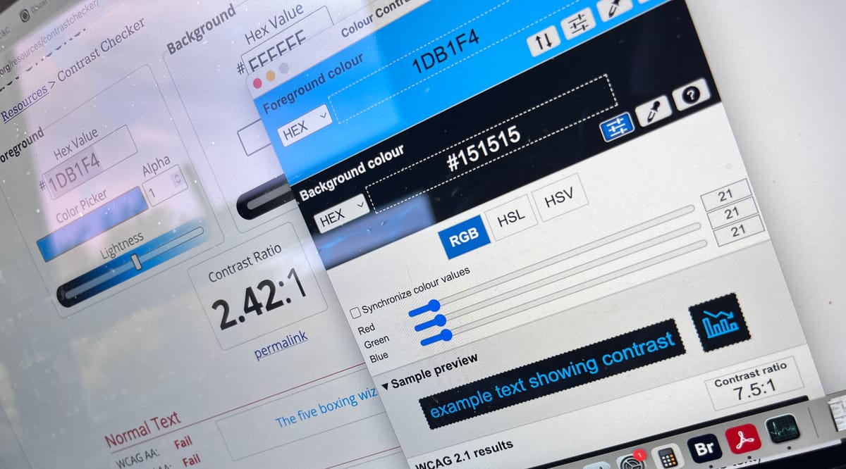
One major challenge I faced in this project was the difference between what appeared legible to my eyes vs. what WCAG specified as accessible. One key colour I used throughout my designs (which was ultimately partially stripped out) was a bright cyan shade. During the design process I believed the use of this colour with white-out text would be non-contentious, however I later discovered it was a firm fail by WCAG standards…
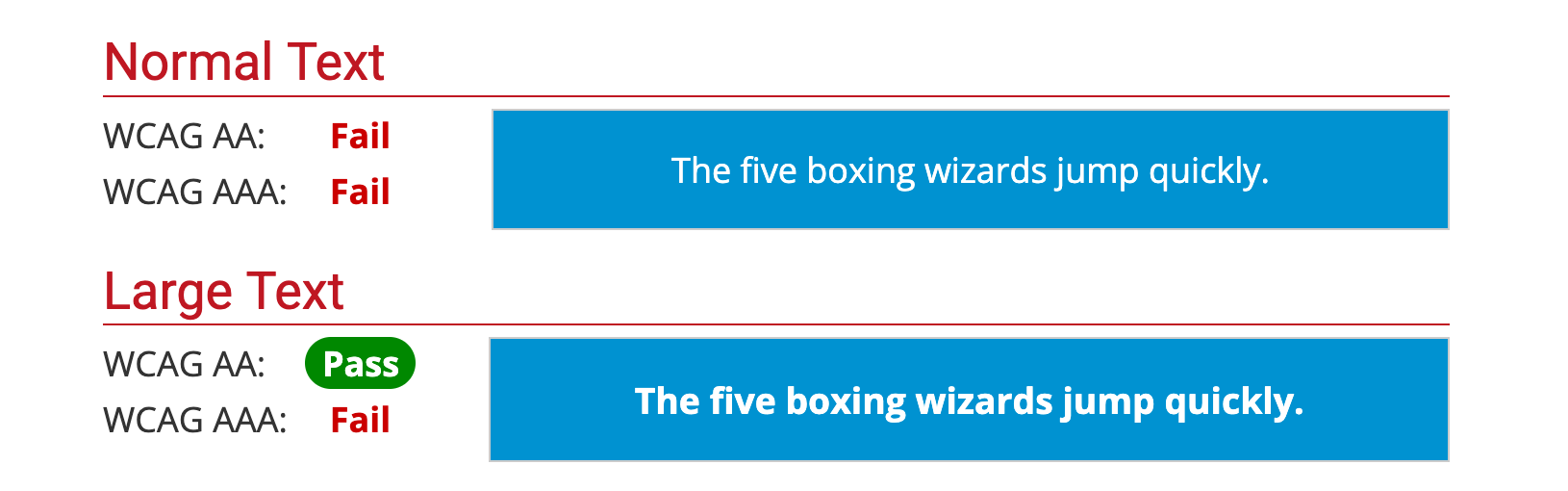
Fair enough. It looks fine to me of course, but I take it on the chin. The client then suggested we switch the text to black, as this will pass. I try it out — and it looks awful (ugly)! Also far less legible, to me at least!
And yet…
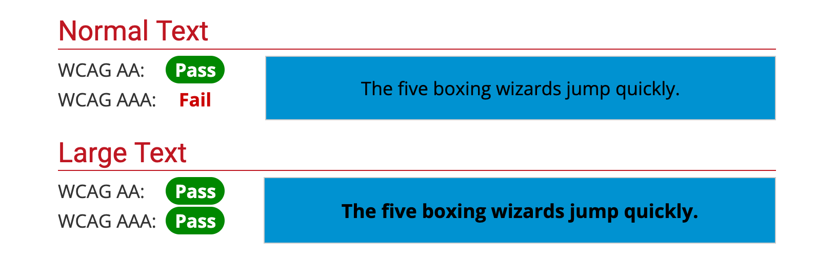
Passes across the board for AA standard.
It just goes to show, that as designers our intuition and what we consider ‘design sense’ will not always lead us to compliant solutions, despite our own convictions around our understanding of colour and legibility.
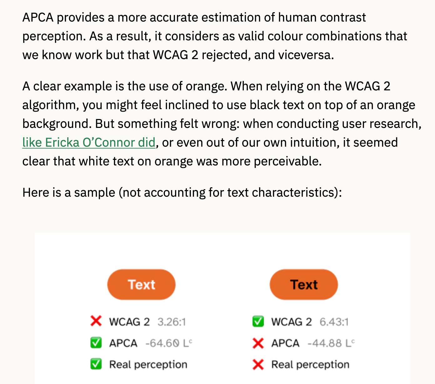
If you wanna get deep into this, my pal V shared with me that there is some debate about how WCAG defines accessibility on certain colours, and that a new standard — APCA — is also on the table as a potential solution to these issues.
It becomes clear that automated standards can have limitations and/or contradictions, and yet they are often held up as the gold standard.
Alt text
Alt text should not be a hard sell. It is easy to implement, incredibly valuable, and can offer vital additional context on images for sighted and blind users alike. It is also a fun creative challenge to write it well.
One interesting dilemma we encountered with alt text on this project related to a particular children’s activity, which consisted of a series of ‘spot the danger’ images… like the one below.
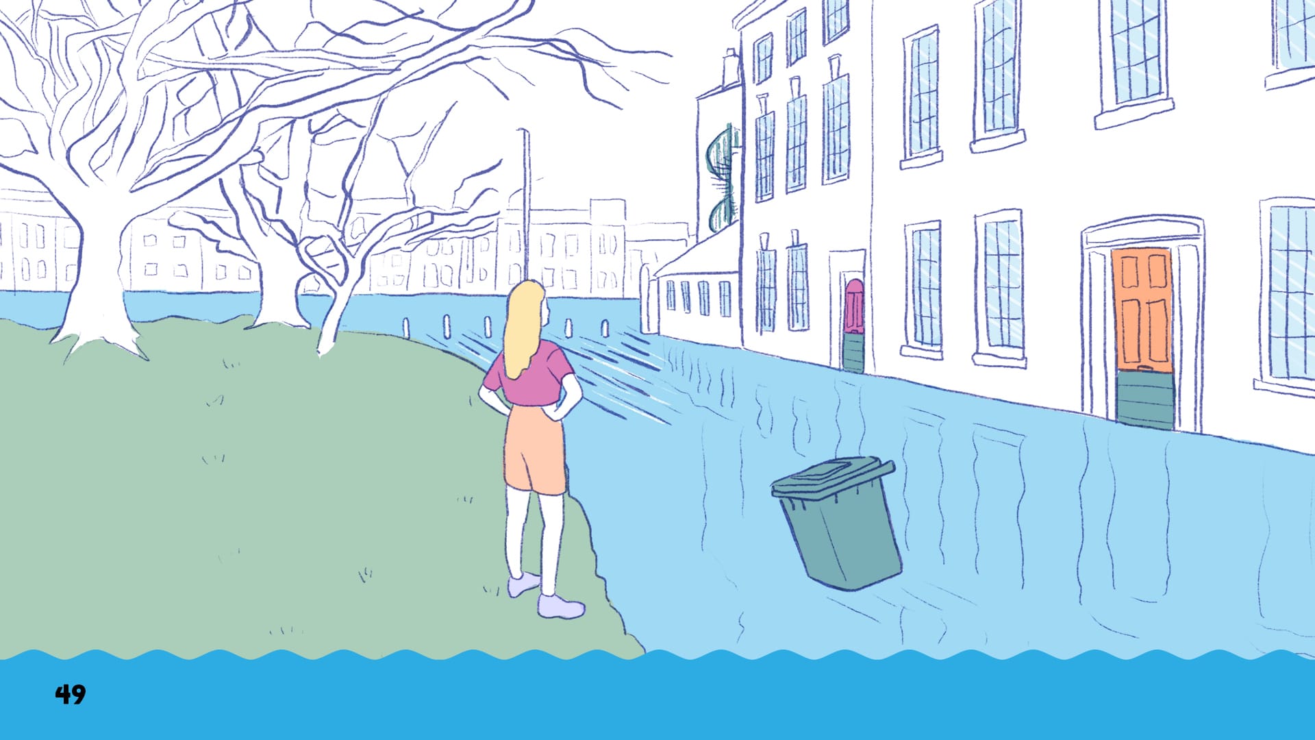
(Look, don’t get me started on those black page numbers which should CLEARLY be white, okay?)
The picture depicts a scene which children who have been paying attention to the lessons so far should be able to identify a number of dangers, and one positive thing.
However, in order to write alt text for this image that avoids turning into a literal ‘picture speaks 1000 words’ essay, the alt text essentially needs to give away the answers to the quiz.
“A row of terraced houses along a street flooded with water. The flood water is flowing rapidly into a river at the end of the street, where some river-edge bollards are just about visible. The doors of the houses on the street are using flood barriers. There is a bin floating in the flood water, and on the other side of the street, a young person is stood very close to the edge of the flood waters, dressed in light summer clothing.”
These are the dangers:
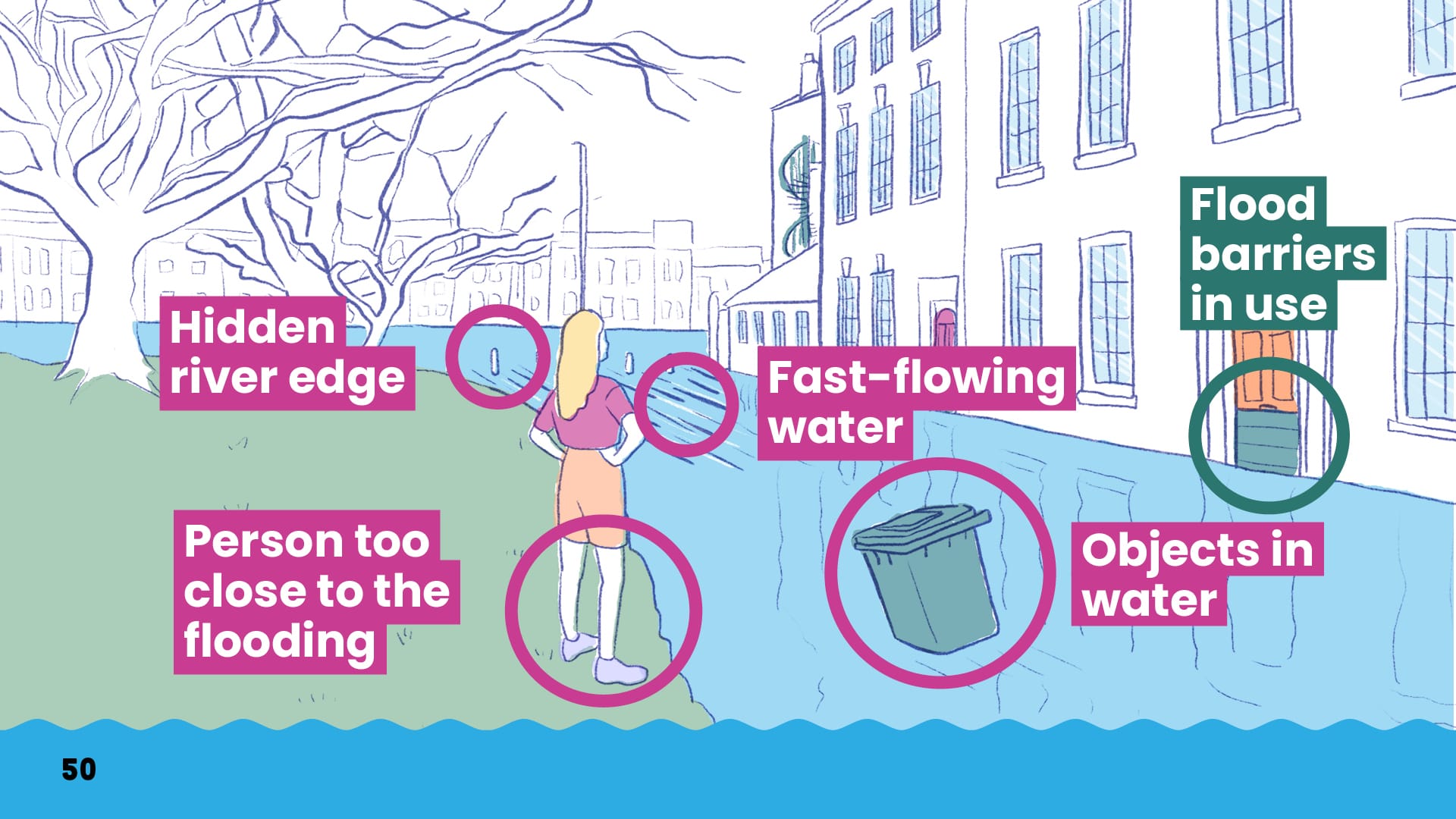
Ultimately we concluded that the people most likely to be engaging with alt text were teachers rather than pupils, so actually, providing them with the answers wasn’t a problem, and it was far less likely to allow pupils to ‘cheat’ at the exercise. But it did force us to reflect a great deal on the likely audience for the accessible documents, while also not wanting to make too many assumptions about their ultimate users. (Might these be used by pupils with screen readers, for example).
Technical implementation of standards
Again, when chatting about this blog with Kim, she noted:
“People do love to downplay the fact it [making our work more accessible] does require additional effort.”
“Like, of course everyone would love their work to be more accessible! But it is a set of compromises over time, budget, audience, and how much the client can value them, etc”
One of the main things I learned during the course of this project was that technical implementation of accessibility to the highest possible standard is HARD, and for a lot of freelance designers (and studio/agency/in-house!) there is no one that teaches you how to do this work. What resources there are out there for self-teaching are scattered, confusing, and often don’t entirely fit the hyper-specific context in which the designer is working. It became clear that neither I, nor the agency, nor the client truly understood the benchmarks we were trying to hit — we just knew that the materials had to be ‘accessible’.
I found myself spending MANY more hours than the client were willing or able to pay me for, grappling with screen-reader functionalities like reading order, document tagging, tab navigation, exporting out PDF after PDF, running the checks, and lightly sobbing as new issues seemed to emerge with each export.
Of course, like many professional skills, sometimes learning on the job is essential. However, learning on the job is much harder when under immense time pressure and without a trusted colleague or mentor to actually confirm when things are right.
During the course of this project, I spoke with a couple of other designer friends about the challenges I was facing, and both of them offered some interesting reflections.
One, an urban planner, recalled several weeks during the early days of COVID where she experienced a remarkably similar journey to me — late nights shut in her flat alone in isolation, poring over complex PDFs for a government agency, desperately trying to make them hit an automated accessibility threshold, with very little support or guidance on how to do so. (Which sounds even more emotionally draining than what I went through, given the additional global context at the time! At least I was able to go over to V’s house and cry about colour contrast).
Another, an old university friend who now works in-house for a large high street bank, bemoaned the fact that all accessibility work there is outsourced — when he creates documents, he is not permitted to export final PDFs — he instead has to pass them to an external agency who do that work for him. In the depths of my technical implementation despair, I thought this sounded dreamy, but he complained it adds additional steps and time management to any given project, and he would much rather be trained to do it himself.
The common cry of both of them (and me!) was for accessibility to be more embedded at the heart of design software, rather than buried deep into arcane menus, and in ways which require substantial extra labour (and education!) on the part of designers — labour which many clients are not willing to spend the money on, despite (on paper) wanting the standards to be met.
For accessibility to truly become a consistent standard in design, extra budget alone is not enough:
- Accessibility functions within design software need to be forefronted, prioritised, and embedded in workflows such that accessibility is a default, not an afterthought.
- Designers need more and louder messaging about the importance of accessibility in design, and access to more opportunities to undertake the kind of training that will support them in implementing it, as well as advocating for it to clients who are still behind the curve.
- I also think that more discussions need to be had about both usability and accessibility earlier on in projects. This hopefully means fewer conflicts between between communication styles and aesthetics that work best for a given audience (like children) and how these might conflict with meeting vital accessibility criteria.
How did it end?
After much stress, faff, late nights watching tutorial videos, tears, meltdowns, anxiety attacks, hours of fiddly labour (why is it like this? Surely it shouldn’t be this hard?) I got the PDFs to the point where they NEARLY passed to the client’s standards, before handing them over to the agency to pass to another, presumably more capable designer.
What broke me? The client wanted the screenreader to be able to tab through bullet by bullet in a bulleted list, and I simply could not find a way of making this happen.
I do fear that despite our longstanding relationship, this will be the last job I ever do for this much-loved agency — I essentially failed to deliver a project that I had been paid to work on, which as a freelancer is pretty unforgivable. (Though my project manager did assure me that this was not the first project where they had experienced such technical challenges around this, they have also... not sent me any work since then).
I have somehow, in my >8 years of freelancing, never ‘admitted defeat’ before and given up a job that was too hard. I’ve always made things work for my clients. Giving up a job like this for a longstanding client who have sent me a lot of work? It’s felt kind of devastating, and very humbling, but somehow has made me even more committed to integrating accessibility standards into my work, and engaging with conversations about accessibility standards at a much earlier stage of design projects in future.
Off my own back (and with my own money) I attended Abilitynet’s “InDesign Accessibility” course https://abilitynet.org.uk/training/indesign-accessibility in June, in the hope that I would never have to suffer like this again (and also so that I can offer more clients deeper accessibility knowledge as standard). In many ways it was a great session, but kind of upsettingly, it turned out that I had self-taught myself pretty much everything covered within it during my previous trials. (And there was no clear answer to the 'tabbing through bullet by bullet' question). That said, if you are a graphic designer who uses InDesign and are grappling with this stuff for the first time, I would very highly recommend it. The main takeaway, as noted, is that accessibility should be baked in from the start of projects, not done as an afterthought — it DOES take extra time and effort, and to what extent it is implemented will be a conversation with each individual client.
I have also learned/accepted that there are times where it may not be possible for one document to do everything. Another regular client, Happy Valley Pride, approached me for their 2025 festival materials. Their main brochure was, as it always is, a chaotic riot of colour. Making this brochure to accessible to the highest standard would have been too much of a compromise for the client's vision. So — we made a seperate accessible version! I took everything I've learned over the last few months and put it all into this, and I am delighted with how it turned out — and feeling a lot more confident about tackling these challenges with future clients, particularly those with the energy and motivation to give this topic the time and budget it deserves.
Further reading:
- Can Accessibility be Whimsical? — grapples with some of my challenges around chaotic/rowdy/maximalist/colourful design vs. accessibility requirements, but from a website design context.
- Previously mentioned Mismatch: How Inclusion Shapes Design by Kat Holmes, a great primer to accessible design more generally
- A broader perspective on design for disability, to accompany the extraordinary 'Design and Disability' exhibition at the V&A (open until 15th Feb 2026), the accompanying book, next on my reading list, which centres the contributions disabled people have made to design through a series of case studies.

Comments ()