Can you subvert YouTube's battle for your eyeballs?
YouTube's homepage is a slot machine: brightly lit, loud, ephemeral, provocative, uncertain, and there to make money for the house. Exposing its design principles is a surprisingly complicated task. Micah has a crack at it, investigating how a browser extension might take away the house's edge.
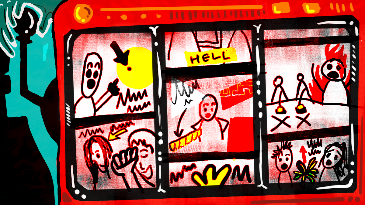
Understanding virtual worlds is important because “we increasingly live in a world in which opting out of technological systems is more and more difficult and yet participation within those systems pushes us to accept structures we might oppose” (Taylor 2006a:135). - Tom Boellstorff (Coming of Age in Second life: An Anthropologist explores the Virtually Human)
Back in 2020, memewhile.mp3 and I facilitated a discussion with a small group over a Design Baithak, about how the culture of livestreaming was meeting the world of political campaigning. We tried to put together a sense-making exercise deriving from the affordances of a Twitch-like platform and its associated subculture to try to understand how manufactured authenticity was about to become the new wave of algorithmic manipulation. Since then, corporate social media accounts have en masse transitioned from a professional matter-of-fact approach to a more ‘based memester’ culture of wink wink hot takes, weaponising a perception of authenticity through “unhinged” interactions for clout (e.g. Duolingo and Wendy's).
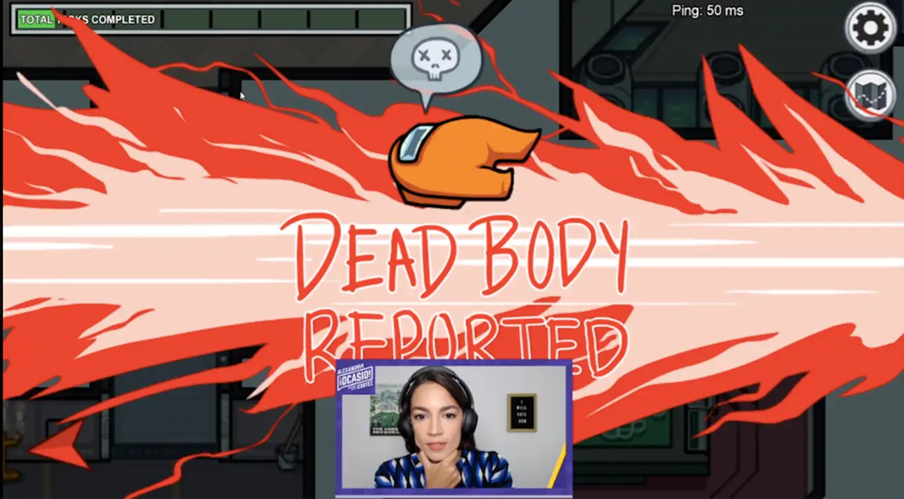
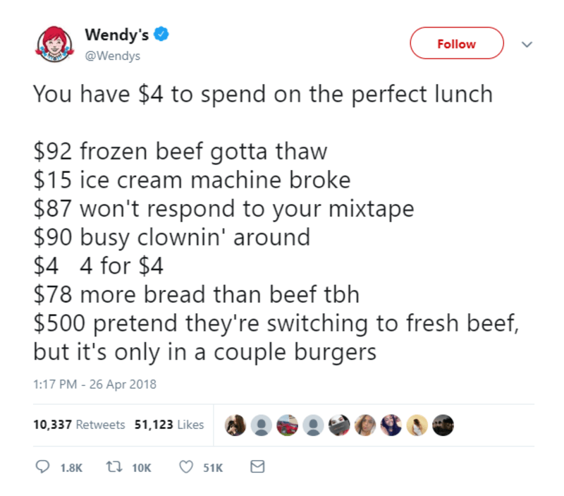
Left: AOC plays Among Us on Twitch. Right: Wendys' “You have $4 to spend on the perfect lunch’ meme
This was also the time that platform designers like Are.na started talking about anti-virality as a platform dynamic. Since then I have been experimenting with different ways to conduct forensic analyses on platform interface design to understand the intentions behind it so as to develop counter-patterns that are explicitly anti-billionaire.
YouTube's home page, for example, is an interesting and contentious place full of strife, alliance and betrayal. The other name-brand platforms have the same type of intrigue and drama happening on the page where “the magic happens”. The algorithms that we rely on to structure these platforms are discussed by Answer In Progress in their YouTube video History of the YouTube Algorithm, where they talk about how YouTube started moving the engine of the recommendation algorithm from using self-describing tags that creators added, to correlations between different viewers' habits.
In the rest of this article I am going to analyse YouTube's homepage interface and investigate the potential impact of a extension called Dearrow in making the homepage less ephemeral and sensationalist. In the context of this article, we are going to go through the forces and tools that act on digital spaces like the homepage to drive and manipulate user behaviour. This exercise can be a building block in developing a design practice that is opposed to the way that platforms are built right now.
If we can identify the hostile architectures of these spaces we inhabit, we might make sense of how these spaces are being constructed.
The Canvas being painted
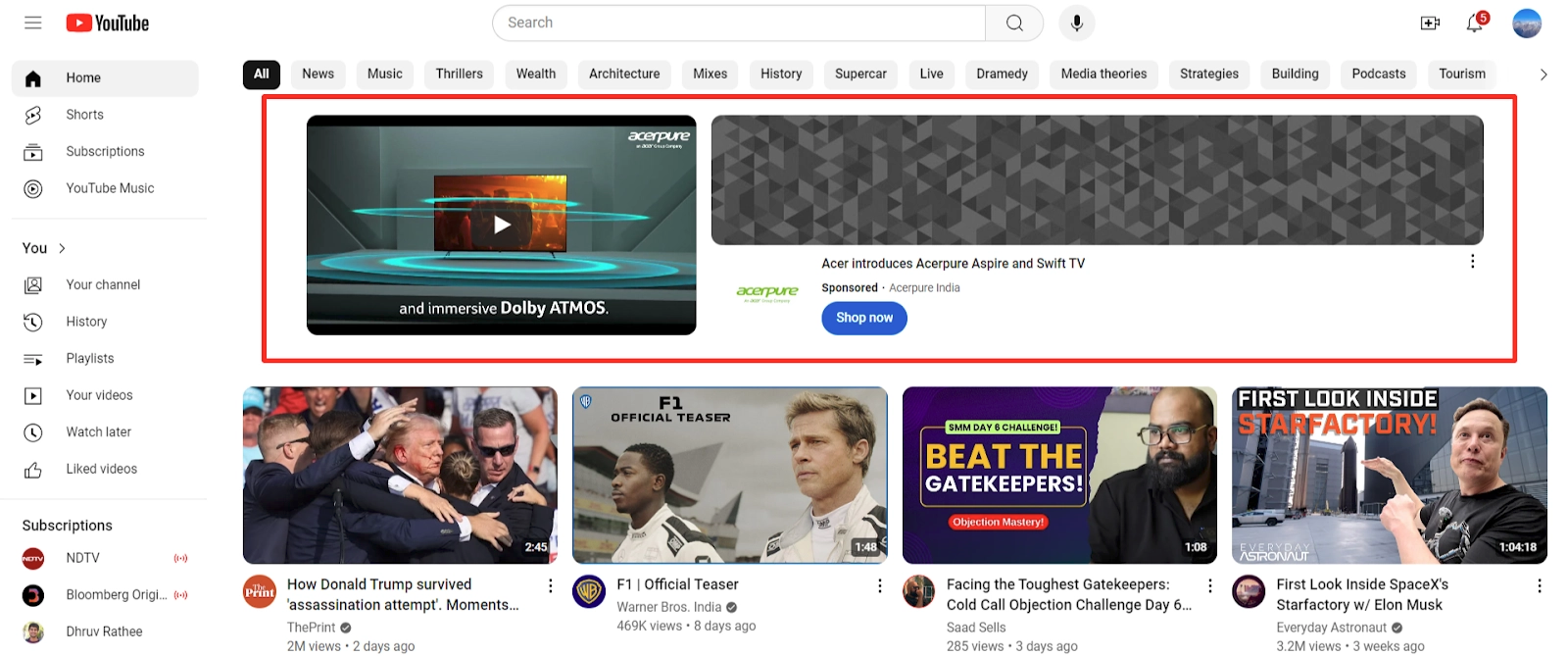
Understanding the YouTube homepage
The YouTube homepage is an infinitely scrolling canvas for stakeholders of the platform to enact their actions and decisions on. The shape of this canvas is determined according to Google's magic data gathering systems and optimizing between reportedly 80 billion signals. It follows a simple grid system housing different types of video content depending on the viewer's device.
A/B testing directly enacted on this homepage interface is a particular manipulation tool that is useful to study for our needs. A/B testing has been part of the Design Thinking and developer toolkit for a while. However, as these sites mature, different groups of people have started to use it, like PR teams, state-controlled algorithm manipulators and other such players. Facebook conducted a large scale study on the effects A/B testing words that conveyed different emotional information and essentially wrote the playbook for this manipulation tactic. A/B testing is one of the tools that might make a platform feel slippy, because there is very few ways to approach ground truth as a user.
One example of this is Amazon. Our entire reality on Amazon is on shaky ground because of its algorithm. There is no accessible way to remember or bookmark prices, no way to mark these prices against dates, no way to know if the prices you are seeing are because you logged in with your account or if they would have been different if you used a private tab first. There is no way to know if you are seeing discounts on some products because other people who have been in your vicinity have them or if others see the same discounts you do. How do you tell what is true on there anymore? You will find many more examples in the retail space.
Display technology like e-ink suddenly saw a huge capital inflow after stagnating for a decade because the potential to make signs that are dynamic, low-energy and ‘safe-feeling’ is transformational. The North American killing of mom and pop shops are starting to pay dividends in the AI era. Terms like ‘surge pricing’ that entered the Overton Window of acceptable concepts through other algorithm abusers like Uber are poised to become a ubiquitous concept in the brick and mortar shopping spaces as well. It is already hard to tell if all the supply of a certain product is from one single parent brand that has 15 different sub-brands. Now we will be faced with the uncertainty of how the weather forecast for the day will change the prices of goods in the evening. ️

The actors on the stage
Who are the major stakeholders that use the YouTube homepage, and what is their influence on it?
Advertisers
Advertisers get a choice of “In-Feed Video Ads” in the few rows of the home page, or “Masthead Ads’ that display on top of the homepage as banners (as of March 2025).
What can advertisers do to the homepage?
- Buying “In-Feed” ads. Here the risk is shared between Google and the advertiser. Google only gets paid when users engage, making this a performance-based model where results directly drive costs. The cost to Google is real-estate on the homepage.
- Buying Masthead ads. Risk shifts primarily to the advertiser, who pays for impressions regardless of user action. This creates a guaranteed revenue stream for Google, but provides no inherent performance guarantee for advertisers.
Google (Alphabet)
Google is an US advertising company, bundling all its advertising under “Google Services”, which makes up 87% of their total revenue. 47% of this revenue comes from the USA. Advertising as the primary focus means they want to focus on optimising a US-based user's satisfaction to a point where they can safely introduce a slew of different types of ads and be assured that they will not drive this paying customer away.
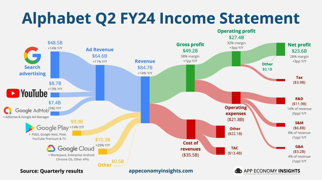
Left - Alphabet's Total revenue in 2024 Q2 is $84.7B with ad revenue at $64.6B (+11% YoY). Right - More than 50% of YouTube ad earnings come from the USA
What can Google do to the homepage?
- Choose homepage videos that have a higher probability of the US viewer watching a long segment and engaging with its ads
- Tinker with the the layout and interaction design every so often so that the experience for the user is frictionless and novel enough that ads and other bothersome behaviour from their side are not too irksome
- Track viewer demographics and viewer behaviour on the homepage so as to have better control on their finetuning
- Repeatedly change their algo-bothering tactics, to keep everyone guessing about what kind of content is rewarded while maintaining their ultimate power over the homepage.
Curators
Curators are the reclippers, the compilation-makers, the summarisers, the reactors and playlist makers.
What can curators do to the homepage?
- Curate lists and repackage videos that can appear on the homepage
- Curate by theme, trending-ness, affiliate programs
Viewers
Viewers hold the least influence over the platform but the most influence over what is served to them, mostly unintentionally.
What can viewers do to the homepage?
- Change default settings like homepage autoplay enabled, or opt out of Google's cross-platform tracking
- Modify the medium they view the homepage on with adblockers or unofficial clients etc.
- Use the “not-interested” feature
YouTubers (Creators)
Finally, the “content creators” who fill YouTube with content and then track numbers to make sure discovery of their content is optimized from the start.
What YouTubers can do to the homepage
- Choose what content they will make depending on what is popular on the platform at that point of time
- Do the labour to populate the site with content that makes the platform worth using in the first place
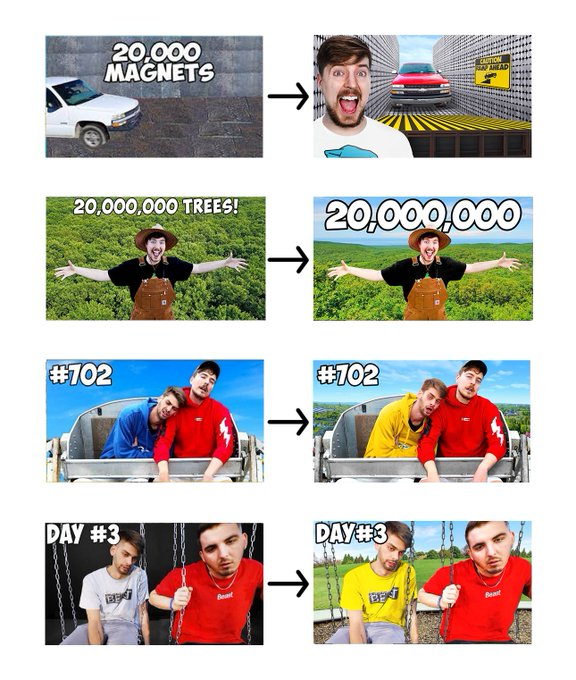
- Beta-test different thumbnails and titles, changing their strategy each time with what the algorithm is currently rewarding. This may or may not have any correlation with what the user wants to see. Some of the obsessive ones like Mr. Beast even change their thumbnails and titles every few hours.
Understanding the Town Square
What principles have been employed to make the YouTube Homepage?
All mainstream UX design theory asks us to use design in the service of convenience. Minimizing inconvenience and friction are good goals to have for user experience; however, these can be shrouds for the uncertainty of the interface. This can work against the user's favour in ways that are not immediately apparent.
Viewers of the YouTube home page are bombarded by catchy thumbnails and clickbait titles that change every few hours. They may not see a video again unless they save it on a playlist or make a note. They don't know why any videos appear on their homepage, and if the creators they subscribed to will appear. They don't know if a video appeared because someone else in the house watched something similar.
Are we just eyeballs to be ping-ponged by the powers that be? Resolving these uncertainties is important if we are to form a mental model of how internet marketing works.
It is interesting then to approach things with a "ground-truth" lens to designing. This mode of design assumes that something has been hidden and the design must reveal it. This is a different mode of design than making experiences on an interface more smooth and transaction-friendly. How do we help the user approach the truth of how a platform presents options to us?
The homepage is an illusive infinite scroll that is constantly changing. If the design reveals to the user the flow and speed of this illusive river, can they decide if or how they want to swim in it? How might we facilitate this vision for the user?
Boundary Objects
One way to understand the homepage and the network of actors that change it is to see it as a boundary object. Boundary objects are a concept in communication and organizational studies that describe artifacts, documents, terms, or concepts that help different groups work together and communicate across their boundaries, even when they have different perspectives or understanding of the object itself.
Boundary objects should be conceptualized as evolving artifacts that become understandable and meaningful as they are used, discussed, and refined (Ostwald, 1996).
For example, a medical chart acts as a boundary object between doctors, nurses, administrators, and insurance companies. Each group interprets and uses the chart differently:
- Doctors use it to track treatment decisions
- Nurses use it for day-to-day patient care
- Administrators use it for resource allocation
- Insurance companies use it for billing purposes
[...] boundary objects should be conceptualized as reminders that trigger knowledge, or as conversation pieces that ground shared understanding, rather than as containers of knowledge. The interaction around a boundary object is what creates and communicates knowledge, not the object itself (Fischer & Otswald, 2o03).
If we consider the YouTube homepage to be a boundary object, it is necessary for the different actors that use it be able to refine, discuss and converse around it. Each stakeholder other than the viewer is able to discuss and take intentional actions to tweak the interface. The most visible tool that is at their disposal is the Subscribe button, but this has lesser impact for their own homepage than it does for every other stakeholders' purposes as a metric. This hierarchy is inherent to the design and in service of getting the viewer to do certain things on the homepage.
For our purpose of developing a counter-design pattern language we'll now study one intervention that helps the user understand and document the mechanisms, actions and strategies that the other actors use against them.
The phenomenon of communication depends on not what is transmitted, but on what happens to the person who receives it. And this is a very different matter than transmitting information (Maturana & Varela, 1987).
Subverting YouTube with DeArrow
How can DeArrow modify the YouTube Homepage?
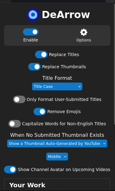
DeArrow is a browser extension that attempts to give the viewer more agency over the YouTube homepage. From the projects' homepage:
DeArrow is an open source browser extension for crowdsourcing better titles and thumbnails on YouTube. The goal is to make titles accurate and reduce sensationalism. No more arrows, ridiculous faces, and no more clickbait.
As discussed, the viewer is the least influential actor on the platform but the most influential on their own feed. DeArrow aims to fight this injustice by letting viewers organise themselves in a way that helps them collectively peek under the illusive infinite scroll.
DeArrow does this by replacing sensationalist thumbnails with actual video frames and reformatting misleading titles to be more descriptive, prioritising DeArrows' users choices over Google's algorithmic manipulation. This intervention happens at the visual layer, precisely where YouTube's attention economy does its most persuasive work.
I am trying below to get at the design principles behind this extension, however, this is more than a study of what has been documented by Ajay, who is the creator. This method of analysis uses a simple heuristic - The purpose of a system is what it does. I look at what DeArrow achieves and work backwards.
What design principles can we learn from DeArrow?
Give viewers more agency over defaults
Google builds the defaults on the homepage to profit from and grow its ad business. In order to do that, all the platform defaults a tradeoff between user convenience and maximum advertisement consumption. This includes co-opting creators to help decentralise the “attract eyeballs and keep them there” motivation. Creators are incentivised to create clickbaity thumbnails and titles, effectively becoming unpaid dataset creators and agents of Google's ad business.
DeArrow disrupts this process at its origin, making changes before the page can be visually consumed. It restructures the primary experience of interest and discovery for the user by shifting agency to the viewer. It uses open web standards that work on the browser level that don't depend on Google's servers.
Understand and Guard against Network effects
DeArrow's documentation states:
"Clickbait" isn't the exception anymore, it's becoming the norm. Many have even started going through their entire backlog, changing old titles and thumbnails to be more attention grabbing and vague. It's no one's fault. It's a system that creates a race to the bottom.
Dearrow's design comes from a place of understanding how the actors work on the homepage. It then sides with the viewer because the platform is inherently asymmetrical, in terms of agency, tooling and capability. It creates an infrastructure for collective decision-making.
Viewers submit alternatives and vote on them, creating a designed tool that offers a counter-narrative to YouTube's algorithmic curation. It also puts effort into masking its users from Google's servers when using the extension. It does the following operations:
- When you watch a YouTube video, instead of sending the actual video ID to the DeArrow server, the extension:
- Takes the video ID
- Hashes it (creating a long string like
5f6b0b4e201f2a7e66927abb5cadeec81624dcc8efe6644b78aa182213f653a2) - Sends the first few characters of the hash (e.g
5f6b) to the server
- The server then responds with data for all videos that match this hash prefix. For example, a request might return data for 11 different videos that all start with the same hash prefix.
- DeArrow looks through the list locally to find the specific video you're watching. If your video isn't in the list, it treats it as not found.
- After the video has been found, it brings up the alternative caption and thumbnail
This makes the user atleast a little safer against retaliatory bans, rate limiting or IP-blocks.
Make contributing and unionizing easy
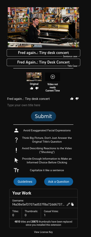
What makes DeArrow particularly interesting as a counter-design tool is its community-driven approach. DeArrow helps viewers make choices that are good for the community of viewers while not significantly sacrificing their own interests. Viewers can contribute better titles and thumbnails easily by using the extra buttons that it adds to the user interface. It offers two versions of a user submission form. One is a casual form that just asks if the viewer likes the title, and to describe the title using one-word checkboxes. The other is a more detailed form that allows viewers to suggest an alternate title and thumbnail.
Make evaluating contributions easy
DeArrow implements a voting system similar to its predecessor SponsorBlock, which uses weighted random distribution to ensure that new submissions still get exposure despite having fewer votes than established ones. As described in the documentation:
This formula makes small amount of votes (under 10), matter a lot, and makes the really large votes slowly not matter as much. This makes a newly submitted [alternative] always possible to be sent out to users to get votes.
Make role mobility easier
DeArrow blurs the lines between the designer, viewer, and developer. It decentralises functions like creation, curation, collection and adaptation of the interface for the viewer.
Don't add extra friction to subversive behaviour
DeArrow stores the titles and thumbnails as text which is the least storage-intensive format, making it fast to load. Thumbnails are generated on the viewer's browser.
When no community submissions exist, DeArrow still makes do by:
- Reformatting titles to user-specified conventions (title case or sentence case)
- Replacing thumbnails with random video frames
- Adding a “show original” button
Create redundancies
DeArrow's creator made the dataset and the server that stores it open-source, sharing server resources with SponsorBlock. It hosts a thumbnail cache of recently created thumbnails, and gives viewers the option to fetch the fastest option between cache and local images.
This comes from an understanding that open-source communities hold very dearly: when you have no control over the source-code, the platform can make dictatorial decisions that render your intervention obsolete. On walled garden platforms that claim IP by aggregation of user generated content, subversive interventions have to be careful. You cannot get too big, you can't be making money and you cannot be pissing off big brother as evidenced in the Musi lawsuit. Software maintainers are frequently overworked and are often the single point of strength or failure for an entire codebase that is already on precarious grounds . It is therefore important to work with few resources and spread the task of maintenance as much as possible.
When the ground (Google in this case) is hostile, it is important for counter-designers to constantly adapt and change strategies. So much of the internet's landscape is controlled by Google and its co-conspirators that it wouldn't take much effort to break the extension. Iterative gradual design (à la Design Thinking) is often not possible in these spaces, hence the need for a new method of design. A better reference instead is platforms designed for piracy, which has a much more mature knowledge model, design and experimentation protocols and redundancy mechanics when fighting these kinds of battles.
Counter designed intentions
By choosing to contest in the arena of discovery, DeArrow takes a stance:
Make the experience of using the homepage peaceful
This has some unintentional consequences. On the illusive infinite scroll, viewers are not allowed to have a memory on the interface. Subscriptions don't mean much in terms of what appears on your homepage. Thumbnails and titles change.
By removing the default thumbnail, often the DeArrow generated thumbnail has a frame with the creator's face on it - allowing the user to create a connection between a face and a channel name. The characteristic of algorithmic convenience is lightspeediness and personal targeting. It is content meant to hit our synapses intimately, aggressively and quickly, and humans are not great decision makers in the face of overwhelming information.
Conclusions
Overall, such interventions probably have limited impact on the profitability of YouTube and pose very little threat to Google's hegemony. Most users use YouTube on mobile devices or TVs, which are much more locked down ecosystems than the web and where such tactics would not work. Another relatively easy vector of attack for Google is its power over the Chromium engine and associated extension store - for eg. Manifest V3 is aiming to make adblockers unusable.
However, I believe breaking down DeArrow's design principles serves us well as a teaching example on how to populate our toolboxes. If the only available tools are the masters' ones, we eventually end up making alternatives that resemble theirs in both form and function. How we view and understand these platforms is essential to the experimentation that we build on as a community.
If we allow interfaces to be memorable, archivable and annotable, we can create spaces for our future selves to come back and reflect and make meaning from this fast and violent method of manipulation, to ruminate on the things we didn’t notice the first time around, and to see the warning signs retrospectively.
Edited with the help of Kim and Sean


Comments ()